library(manifoldsR)
library(magrittr)
library(ggplot2)
library(data.table)
#>
#> Attaching package: 'data.table'
#> The following object is masked from 'package:base':
#>
#> %notin%Using diffusion maps
2026-05-08
Diffusion maps in manifoldsR
manifoldsR provides a fast Rust-based implementation of diffusion maps (Coifman & Lafon, 2006), a spectral method for non-linear dimensionality reduction. Like PHATE, diffusion maps is built on the idea of modelling the data manifold via a random walk, but it produces its embedding directly from the spectrum of the diffusion operator rather than going through a potential-distance MDS step.
Intro
Diffusion maps shares its early pipeline with PHATE: a kNN graph is built over the data, an adaptive Gaussian kernel is applied to produce an affinity graph, and an anisotropic normalisation (the alpha_norm parameter) is applied to correct for variations in sampling density. The result is a row-stochastic diffusion operator P modelling random walks on the manifold.
Where diffusion maps diverges from PHATE is what happens next. Rather than running diffusion for t steps and computing potential distances, diffusion maps eigendecomposes the symmetric form of P. The top non-trivial eigenvectors are the embedding coordinates, scaled by lambda_k^t where lambda_k are the corresponding eigenvalues. The diffusion time t therefore appears as an exponent on the eigenvalues rather than as the number of diffusion steps taken explicitly. Larger t emphasises the dominant manifold directions and suppresses fine structure; smaller t retains more local detail.
The alpha_norm parameter is the distinctive knob in diffusion maps. With alpha_norm = 0 you recover the normalised graph Laplacian; alpha_norm = 0.5 gives the Fokker-Planck operator (removing the effect of sampling density on the drift but keeping it on the diffusion); alpha_norm = 1 gives the Laplace-Beltrami operator, which recovers the underlying manifold geometry independently of sampling density. The default is 1.0.
Compared to PHATE specifically:
- More geometrically transparent. The embedding coordinates are eigenvectors of a well-defined operator, and the embedding dimensions are orthogonal by construction and ordered by importance. Each additional dimension captures a progressively finer scale of variation.
- Tends to produce axis-aligned, symmetric embeddings. Where PHATE produces organic-looking trajectories, diffusion maps often gives more “horseshoe”-shaped layouts, especially for linear trajectories.
- Different failure mode on clusters. When the data is genuinely clustered with little connectivity between clusters, the top eigenvectors of the diffusion operator approximate cluster-indicator functions.
- No MDS step. This makes the final embedding deterministic given the diffusion operator, and avoids the stochastic element that MDS introduces in PHATE.
In practice, for trajectory-like data the two methods give broadly similar answers with different aesthetics. For clean manifold structure diffusion maps is often the cleaner mathematical choice; PHATE tends to be the more visually appealing one.
Running diffusion maps
We use the same synthetic datasets as elsewhere for direct comparison.
cluster_data <- manifold_synthetic_data(
  type = "cluster",
  n_samples = 10000L
)

swissrole_data <- manifold_synthetic_data(
  type = "swiss_role",
  n_samples = 1000L
)

trajectory_data <- manifold_synthetic_data(
  type = "trajectory",
  n_samples = 10000L
)
Clustered data
As with PHATE, diffusion maps is not well-suited to discrete cluster structure. However, the failure mode differs, and it is worth understanding the contrast. With near-disconnected clusters, the top non-trivial eigenvectors of the diffusion operator are approximately cluster-indicator functions: constant within each cluster and near-zero elsewhere. Each cluster therefore collapses to roughly a single point in the embedding. PHATE on the same data shows the same underlying issue but less aggressively: the log transform and MDS step preserve a small amount of within-cluster spread, so you see tight blobs rather than literal points. Neither is particular useful for visualising within-cluster structure, but if diffusion maps collapses harder than PHATE on your data, that is itself a signal: your data is more cluster-like than manifold-like, and you should reach for t-SNE or UMAP! A second caveat: only the top two eigenvectors are plotted here. With 15 near-disconnected components, the spectrum has roughly 15 eigenvalues close to 1, and a 2D plot cannot separate them all: this is why several clusters pile up near the origin. Embedding into a higher n_dim would resolve them, at the cost of no longer being a 2D visualisation.
dm_clusters <- diffusion_maps(
  data = cluster_data$data,
  k = 15L,
  dm_params = params_diffusion_maps(),
  seed = 42L
)

dm_clusters_df <- as.data.table(dm_clusters) %>%
  `colnames<-`(c("DM1", "DM2")) %>%
  .[, cluster := as.factor(cluster_data$membership)]

ggplot(
  data = dm_clusters_df,
  mapping = aes(x = DM1, y = DM2)
) +
  geom_point(mapping = aes(colour = cluster), size = 0.75, alpha = 0.5) +
  theme_bw() +
  ggtitle("Diffusion maps on clustered data")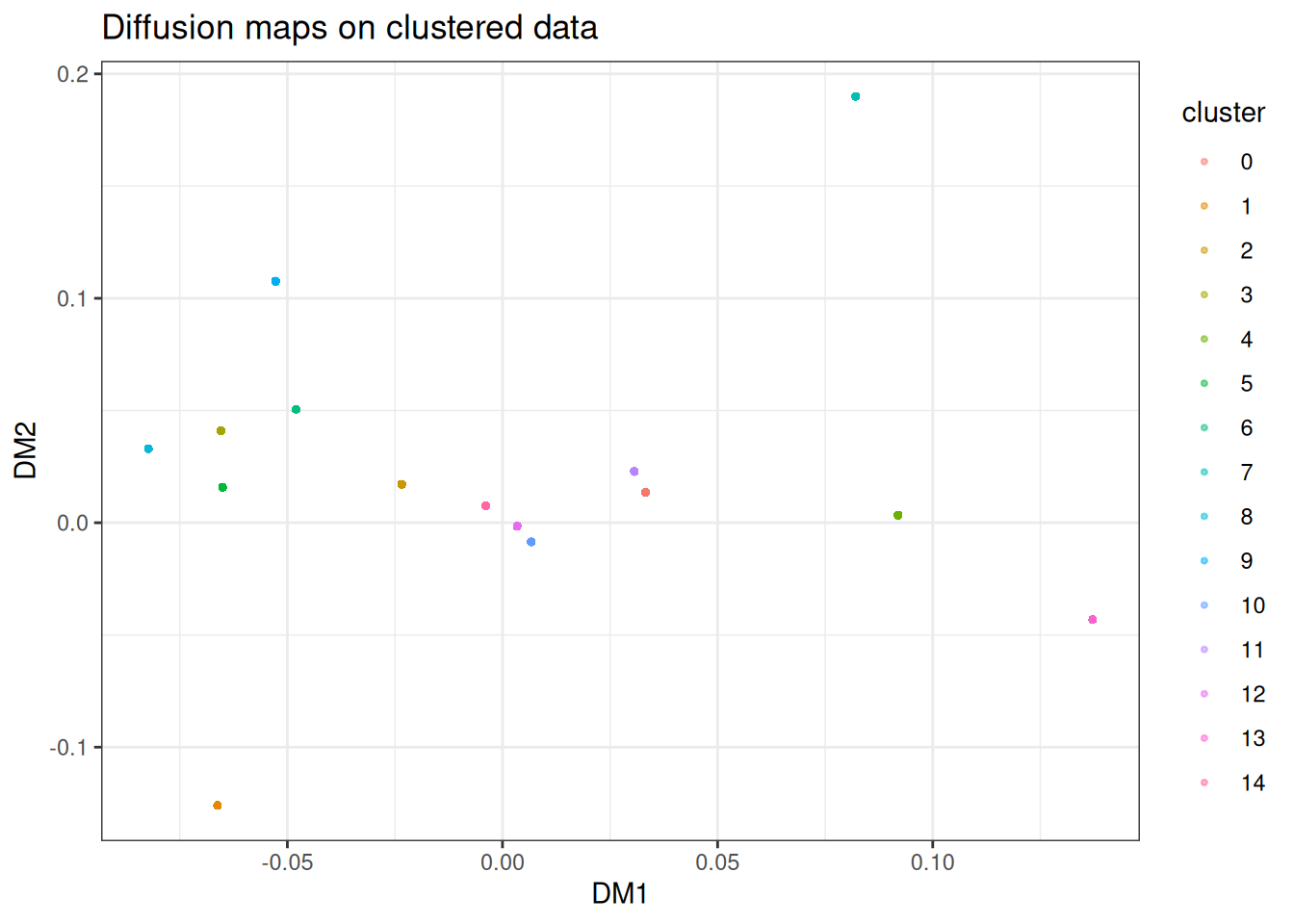
You can typically read off cluster identity from the discrete positions, but any internal structure within each cluster is gone. If this is what your data looks like, reach for t-SNE, UMAP or PaCMAP instead.
Swiss role
The swiss roll is a textbook example for diffusion maps — it was one of the canonical test cases in the original literature. The anisotropic normalisation should recover the underlying 2D manifold cleanly.
dm_swissrole <- diffusion_maps(
  data = swissrole_data$data,
  k = 15L,
  knn_method = "kmknn",
  seed = 42L
)

dm_swissrole_df <- as.data.table(dm_swissrole) %>%
  `colnames<-`(c("DM1", "DM2")) %>%
  .[, z_axis := swissrole_data$data[, 3]]

ggplot(
  data = dm_swissrole_df,
  mapping = aes(x = DM1, y = DM2)
) +
  geom_point(
    mapping = aes(fill = z_axis),
    shape = 21,
    size = 2,
    alpha = 0.5
  ) +
  scale_fill_viridis_c() +
  theme_bw() +
  ggtitle("Diffusion maps on swissrole data")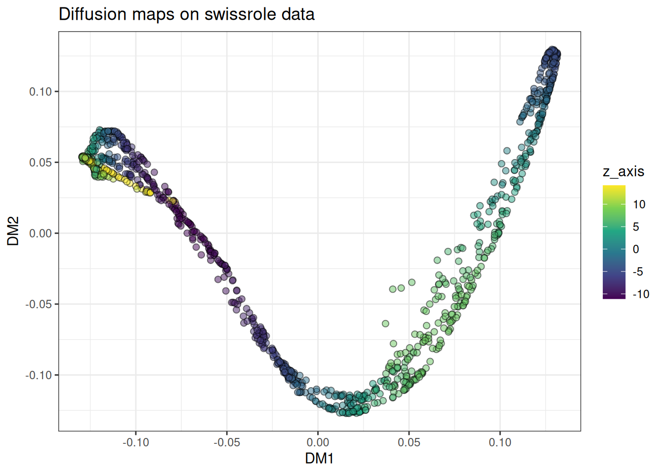
The roll unfolds along a clean gradient along the colour axis, which is the behaviour we want. For this class of problem, diffusion maps is arguably the most principled choice available.
Trajectory
Branching trajectories are another strong use case, though the embedding aesthetic differs from PHATE.
dm_trajectory <- diffusion_maps(
  data = trajectory_data$data,
  k = 15L,
  seed = 42L
)

dm_trajectory_df <- as.data.table(dm_trajectory) %>%
  `colnames<-`(c("DM1", "DM2")) %>%
  .[, branch := trajectory_data$membership]

ggplot(
  data = dm_trajectory_df[
    sample(1:nrow(dm_trajectory_df), nrow(dm_trajectory_df)),
  ],
  mapping = aes(x = DM1, y = DM2)
) +
  geom_point(
    mapping = aes(colour = branch),
    alpha = 0.5,
    size = 0.75
  ) +
  theme_bw() +
  scale_colour_viridis_c(option = "turbo") +
  ggtitle("Diffusion maps on trajectory data")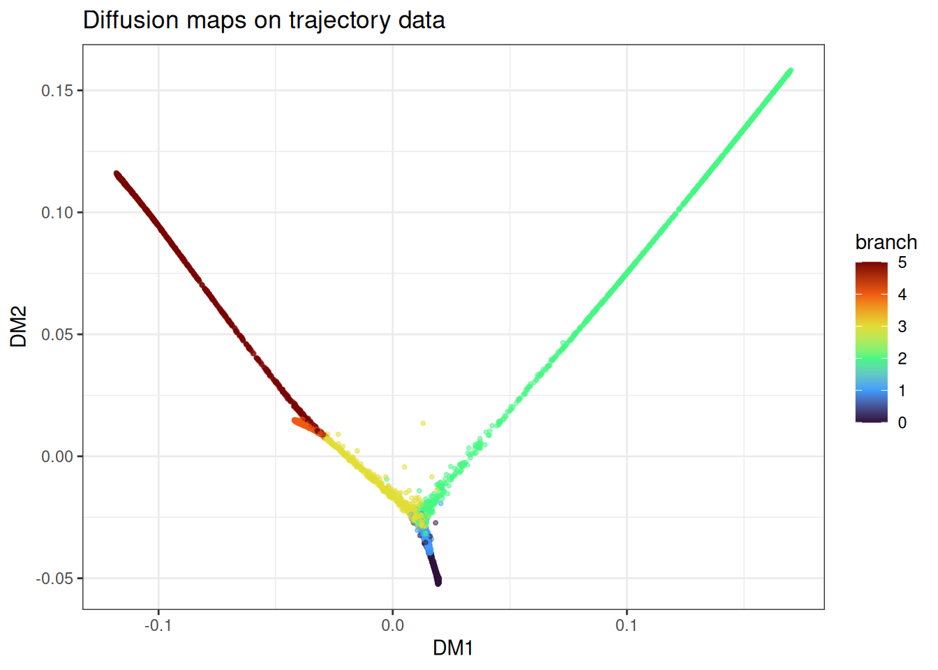
The branches come out as distinct directions in the embedding with the branching point in between. Compared to PHATE on the same data, diffusion maps tends to place branches along more orthogonal-looking axes. Both are valid representations of the same underlying structure.
Using pre-computed kNN graphs
As with PHATE and t-SNE, you can skip repeated kNN searches across parameter sweeps by precomputing the graph once.
precomputed_knn <- generate_knn_graph(
  data = trajectory_data$data,
  k = 15L,
  .verbose = FALSE
)

dm_from_knn <- diffusion_maps(
  data = trajectory_data$data,
  knn = precomputed_knn,
  k = 15L,
  seed = 42L
)
#> Using provided kNN graph.

dm_from_knn_df <- as.data.table(dm_from_knn) %>%
  `colnames<-`(c("DM1", "DM2")) %>%
  .[, branch := trajectory_data$membership]

ggplot(
  data = dm_from_knn_df[
    sample(1:nrow(dm_from_knn_df), nrow(dm_from_knn_df)),
  ],
  mapping = aes(x = DM1, y = DM2)
) +
  geom_point(mapping = aes(colour = branch), alpha = 0.5, size = 0.75) +
  theme_bw() +
  scale_colour_viridis_c(option = "turbo") +
  ggtitle("Diffusion maps from kNN graph")
With the graph fixed, you can iterate on alpha_norm, t_custom, bandwidth_scale, and the landmark settings at minimal additional cost.
Landmark diffusion maps
For large datasets the N x N diffusion operator and its eigendecomposition become prohibitive. The same landmark approach as in PHATE applies: select a representative subset, eigendecompose the L x L landmark operator, and Nystroem-extend the result back to the full dataset. Default is 2048L landmarks, same rationale as PHATE (SIMD-friendly 2^x number downstream in the k-means landmark selection).
landmark_method accepts the same three options as PHATE:
-
"spectral"(default): spectral-clustering-based selection, most geometrically representative, most expensive. -
"random": uniform random sampling, fast, uneven coverage on non-uniform density. -
"density": dampened degree-weighted sampling, cheaper than spectral, may miss rare branches.
large_trajectory <- manifold_synthetic_data(
  type = "trajectory",
  n_samples = 25000L
)

dm_landmark <- diffusion_maps(
  data = large_trajectory$data,
  k = 15L,
  dm_params = params_diffusion_maps(
    n_landmarks = 1024L,
    landmark_method = "spectral"
  ),
  seed = 42L
)

dm_landmark_df <- as.data.table(dm_landmark) %>%
  `colnames<-`(c("DM1", "DM2")) %>%
  .[, branch := large_trajectory$membership]

ggplot(
  data = dm_landmark_df[
    sample(1:nrow(dm_landmark_df), nrow(dm_landmark_df)),
  ],
  mapping = aes(x = DM1, y = DM2)
) +
  geom_point(mapping = aes(colour = branch), alpha = 0.5, size = 0.75) +
  theme_bw() +
  scale_colour_viridis_c(option = "turbo") +
  ggtitle("Diffusion maps with 1024 landmarks (spectral)")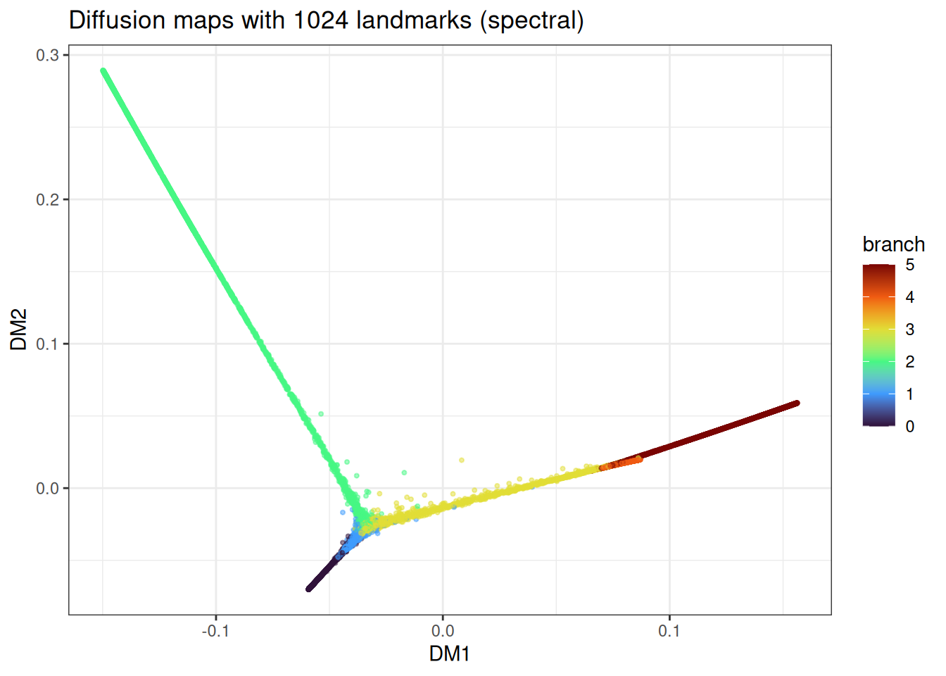
And the cheaper random-landmark version:
dm_landmark_random <- diffusion_maps(
  data = large_trajectory$data,
  k = 15L,
  dm_params = params_diffusion_maps(
    n_landmarks = 1024L,
    landmark_method = "random"
  ),
  seed = 42L
)

dm_landmark_random_df <- as.data.table(dm_landmark_random) %>%
  `colnames<-`(c("DM1", "DM2")) %>%
  .[, branch := large_trajectory$membership]

ggplot(
  data = dm_landmark_random_df[
    sample(1:nrow(dm_landmark_random_df), nrow(dm_landmark_random_df)),
  ],
  mapping = aes(x = DM1, y = DM2)
) +
  geom_point(mapping = aes(colour = branch), alpha = 0.5, size = 0.75) +
  theme_bw() +
  scale_colour_viridis_c(option = "turbo") +
  ggtitle("Diffusion maps with 1024 landmarks (random)")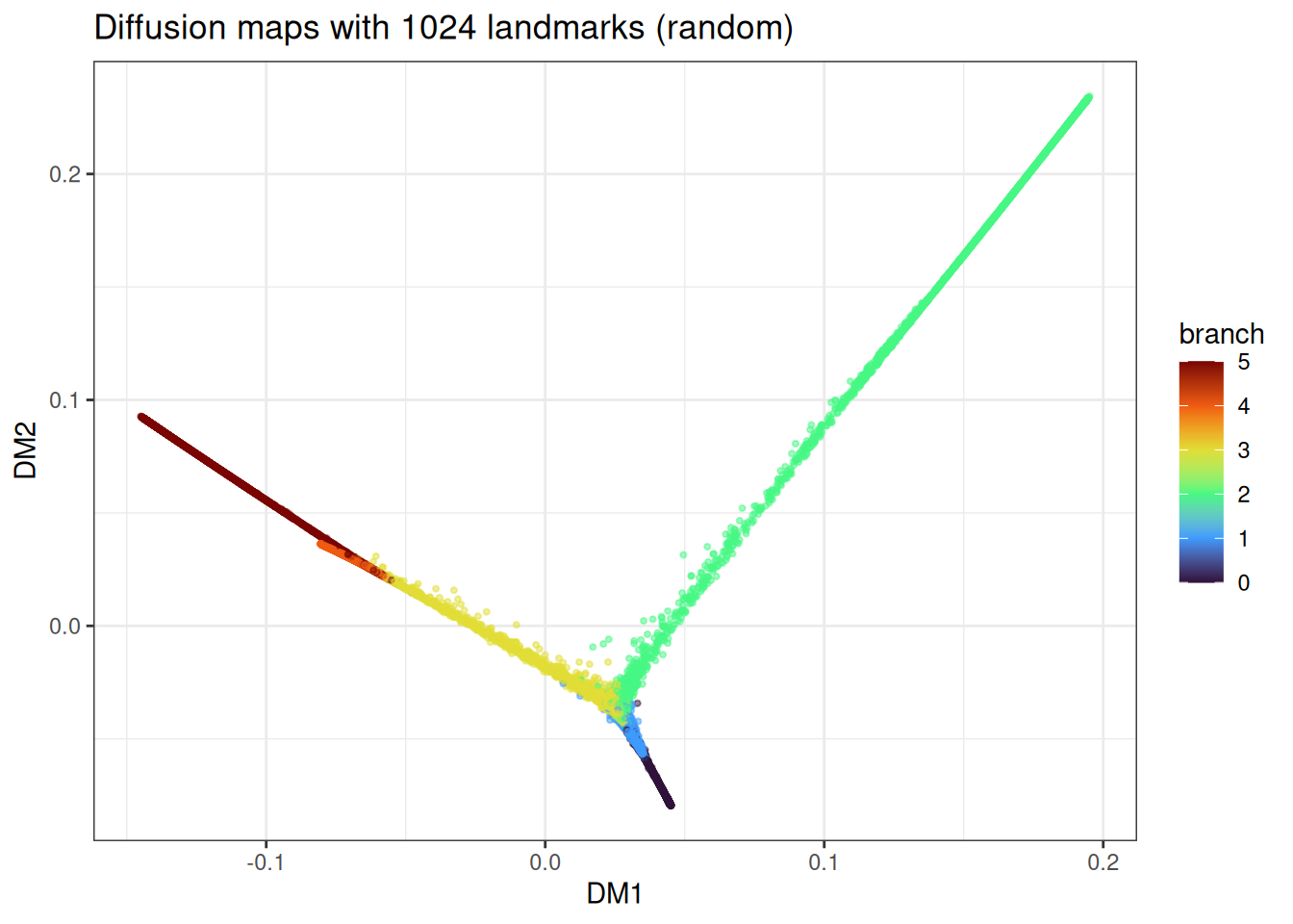
The trajectory topology is recovered in both cases, with minor differences in how uniformly the branches are sampled.
Benchmarks
The most widely used R implementation of diffusion maps is destiny (Bioconductor), which implements the Haghverdi et al. variant aimed at single-cell data. However, the installation of smoother, a needed dependency of the package is not behaving at the moment. Hence, a comparison could not be made here. We can still compare two different landmark methods here on a larger data set.
benchmark_data_large <- manifold_synthetic_data(
  type = "trajectory",
  n_samples = 50000L
)

microbenchmark::microbenchmark(
  manifold_dm_spectral = {
    diffusion_maps(
      data = benchmark_data_large$data,
      k = 15L,
      knn_method = "nndescent",
      seed = 42L,
      .verbose = FALSE
    )
  },
  manifold_dm_random = {
    diffusion_maps(
      data = benchmark_data_large$data,
      k = 15L,
      knn_method = "nndescent",
      dm_params = params_diffusion_maps(landmark_method = "random"),
      seed = 42L,
      .verbose = FALSE
    )
  },
  times = 1L
)
As elsewhere in manifoldsR, the speed gains come from keeping the whole pipeline - kNN, kernel, diffusion, eigendecomposition, Nystroem extension — inside the Rust kernel without bouncing through interpreted code. The gap widens on larger data and becomes particularly pronounced once landmarks are enabled.