library(manifoldsR)
library(magrittr)
library(ggplot2)
library(data.table)
#>
#> Attaching package: 'data.table'
#> The following object is masked from 'package:base':
#>
#> %notin%Using PaCMAP
2026-05-08
PaCMAP in manifoldsR
manifoldsR provides a fast Rust-based implementation of PaCMAP (Pairwise Controlled Manifold Approximation), a dimensionality reduction method that explicitly balances local and global structure preservation through a principled pair-type decomposition and phased optimisation schedule.
Intro
PaCMAP constructs its embedding through three types of point pairs, each targeting a different aspect of structure. Near pairs (k-nearest neighbours) preserve local neighbourhoods. Mid-near pairs are sampled from a window further out in the kNN list - beyond the immediate neighbours but not arbitrary — and act as a medium-range attractive force that anchors global structure. Further pairs are random distant points that contribute a repulsive force preventing collapse.
The key insight in PaCMAP is its phased optimisation schedule. In the first phase, the mid-near weight is dominant, pulling points into a globally coherent arrangement before local structure is resolved. In the second phase, the mid-near weight decays to zero while the near pair weight increases, allowing fine local structure to emerge without destroying the global layout established in phase 1. The third and last phase runs with near and further pairs only, refining the local structure.
This stands in contrast to UMAP, which optimises a single objective from the start and consequently trades off local against global structure throughout. The practical effect is that PaCMAP tends to preserve inter-cluster distances more faithfully than UMAP, without sacrificing local separation.
A few things to keep in mind:
-
PCA initialisation is strongly recommended. Unlike UMAP, where spectral initialisation works well, PaCMAP with random initialisation degrades global structure significantly. The default here is
"pca"for this reason. -
k is less sensitive than in UMAP. The paper default of 10 works well across a wide range of datasets. That said, the kNN search is actually run with
mn_candidate_endneighbours (default 50) to have a sufficient pool for mid-near sampling;konly controls how many of those are used as near pairs in optimisation. -
Mid-near candidates matter. The
mn_candidate_startandmn_candidate_endparameters control the window in the kNN list from which mid-near pairs are drawn. The defaults (skip the 4 nearest, sample up to rank 50) reflect the paper’s recommendations and rarely need changing.
Running PaCMAP
We use the same synthetic datasets as in the other vignettes.
cluster_data <- manifold_synthetic_data(
  type = "cluster",
  n_samples = 25000L,
  parameters = params_clusters(n_clusters = 15L)
)

swissrole_data <- manifold_synthetic_data(
  type = "swiss_role",
  n_samples = 1000L
)

trajectory_data <- manifold_synthetic_data(
  type = "trajectory",
  n_samples = 25000L
)
Clustered data
PaCMAP handles discrete cluster structure well. The mid-near phase anchors the global inter-cluster distances before local structure is resolved, so clusters end up at geometrically meaningful relative positions rather than arranged arbitrarily as in UMAP.
pca_clusters <- prcomp(cluster_data$data)

pca_clusters_df <- as.data.table(pca_clusters$x[, 1:2]) %>%
  `colnames<-`(c("PC1", "PC2")) %>%
  .[, cluster := as.factor(cluster_data$membership)]

ggplot(
  data = pca_clusters_df,
  mapping = aes(x = PC1, y = PC2)
) +
  geom_point(
    mapping = aes(colour = cluster),
    size = 0.75,
    alpha = 0.5
  ) +
  theme_bw() +
  ggtitle("PCA on clustered data")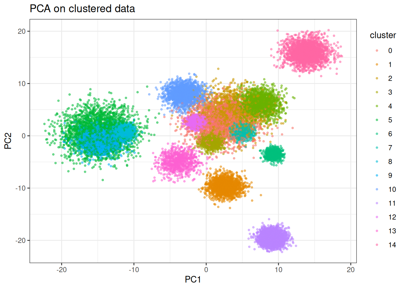
Let’s check out how PaCMAP looks like … ?
pacmap_clusters <- pacmap(
  data = cluster_data$data,
  pacmap_params = params_pacmap(
    mn_candidate_start = 4L,
    mn_candidate_end = 25L, # the official paper default is 50L, but usally this looks better
    n_further = 5L,
    optimiser = "adam"
  ),
  k = 10L,
  seed = 42L
)

pacmap_clusters_df <- as.data.table(pacmap_clusters) %>%
  `colnames<-`(c("PaCMAP1", "PaCMAP2")) %>%
  .[, cluster := as.factor(cluster_data$membership)]

ggplot(
  data = pacmap_clusters_df,
  mapping = aes(x = PaCMAP1, y = PaCMAP2)
) +
  geom_point(
    mapping = aes(colour = cluster),
    size = 0.75,
    alpha = 0.5
  ) +
  theme_bw() +
  ggtitle("PaCMAP on clustered data") +
  scale_color_viridis_d(option = "turbo")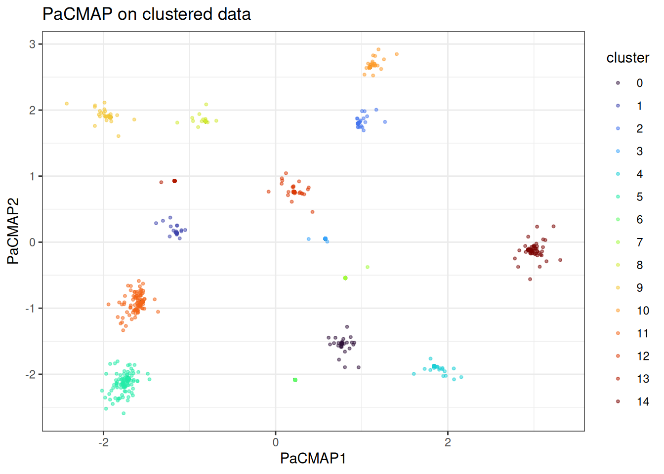
The clusters are well-separated. Another interesting detail is that we have some points that are further away from the rest and the actual statistical noise of the data is being better captured here.
Swiss role
The swiss role tests continuous manifold preservation. PaCMAP should unroll it cleanly, with the colour gradient along the roll preserved in the embedding.
pacmap_swissrole <- pacmap(
  data = swissrole_data$data,
  k = 5L,
  knn_method = "exhaustive",
  pacmap_params = params_pacmap(
    mn_candidate_start = 4L,
    mn_candidate_end = 15L,
    n_further = 5L,
    optimiser = "adam_parallel"
  ),
  seed = 42L
)

pacmap_swissrole_df <- as.data.table(pacmap_swissrole) %>%
  `colnames<-`(c("PaCMAP1", "PaCMAP2")) %>%
  .[, z_axis := swissrole_data$data[, 3]]

ggplot(
  data = pacmap_swissrole_df,
  mapping = aes(x = PaCMAP1, y = PaCMAP2)
) +
  geom_point(
    mapping = aes(fill = z_axis),
    shape = 21,
    size = 2,
    alpha = 0.5
  ) +
  scale_fill_viridis_c() +
  theme_bw() +
  ggtitle("PaCMAP on swiss role data")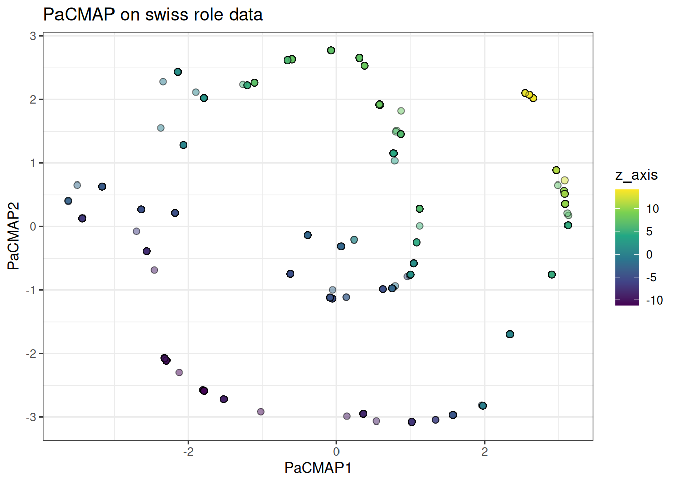
Also, in this case, PaCMAP can actually identify the underlying Swissrole structure better than tSNE or UMAP (please refer to these vignettes to see the differences).
Trajectory
The trajectory data tests whether branching structure is preserved. PaCMAP’s mid-near phase should keep the branches at sensible relative positions, though PHATE remains the stronger choice if trajectory recovery is the primary goal.
pacmap_trajectory <- pacmap(
  data = trajectory_data$data,
  k = 10L,
  pacmap_params = params_pacmap(
    mn_candidate_start = 4L,
    mn_candidate_end = 25L,
    n_further = 5L,
    optimiser = "adam_parallel"
  ),
  seed = 42L
)

pacmap_trajectory_df <- as.data.table(pacmap_trajectory) %>%
  `colnames<-`(c("PaCMAP1", "PaCMAP2")) %>%
  .[, branch := trajectory_data$membership]

ggplot(
  data = pacmap_trajectory_df[
    sample(1:nrow(pacmap_trajectory_df), nrow(pacmap_trajectory_df)),
  ],
  mapping = aes(x = PaCMAP1, y = PaCMAP2)
) +
  geom_point(
    mapping = aes(colour = branch),
    alpha = 0.5,
    size = 1
  ) +
  theme_bw() +
  scale_colour_viridis_c(option = "turbo") +
  ggtitle("PaCMAP on trajectory data")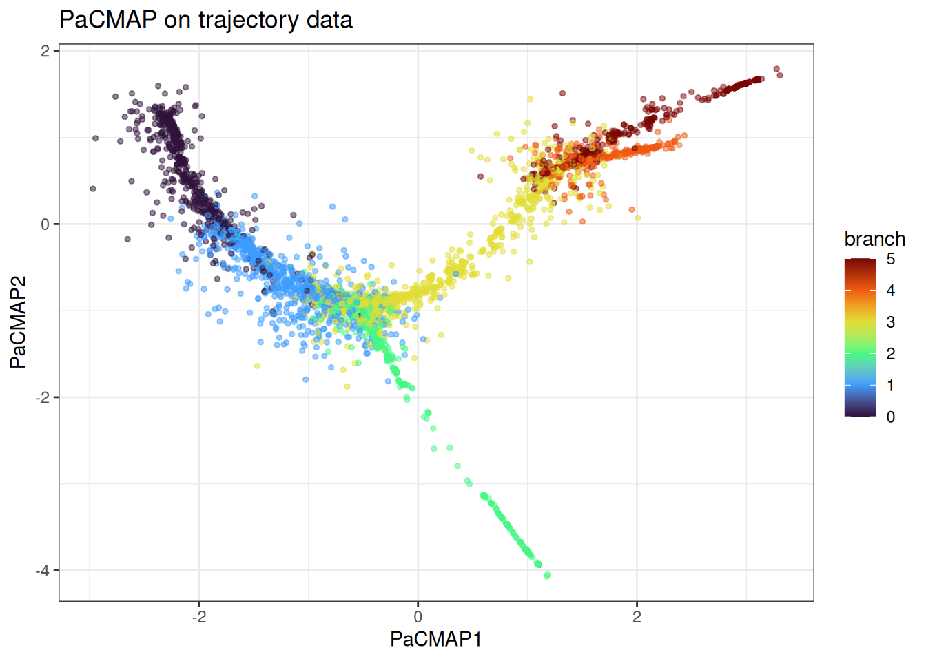
Hierarchical structure
The hierarchical cluster data is where the difference between PaCMAP and UMAP is most stark. UMAP tends to collapse supergroup distances arbitrarily — clusters from different supergroups can end up adjacent, and the global relational structure is lost. PaCMAP’s mid-near phase anchors the supergroup distances before local structure is resolved. Let’s generate first the hierarchical data.
hierarchical_data <- manifold_synthetic_data(
  type = "hierarchical",
  n_samples = 25000L
)
And now let’s run PacMAP over that hierarchical data
pacmap_hierarchical <- pacmap(
  data = hierarchical_data$data,
  k = 10L,
  pacmap_params = params_pacmap(
    mn_candidate_start = 4L,
    mn_candidate_end = 25L,
    n_further = 5L,
    optimiser = "adam_parallel"
  ),
  seed = 42L
)

pacmap_hierarchical_df <- as.data.table(pacmap_hierarchical) %>%
  `colnames<-`(c("PaCMAP1", "PaCMAP2")) %>%
  .[, supergroup := as.factor(hierarchical_data$membership$supergroup)] %>%
  .[, subgroup := as.factor(hierarchical_data$membership$subgroup)]

ggplot(
  data = pacmap_hierarchical_df,
  mapping = aes(x = PaCMAP1, y = PaCMAP2)
) +
  geom_point(
    mapping = aes(colour = subgroup, shape = supergroup),
    size = 1,
    alpha = 0.5
  ) +
  theme_bw() +
  ggtitle("PaCMAP on hierarchical data") +
  scale_colour_viridis_d()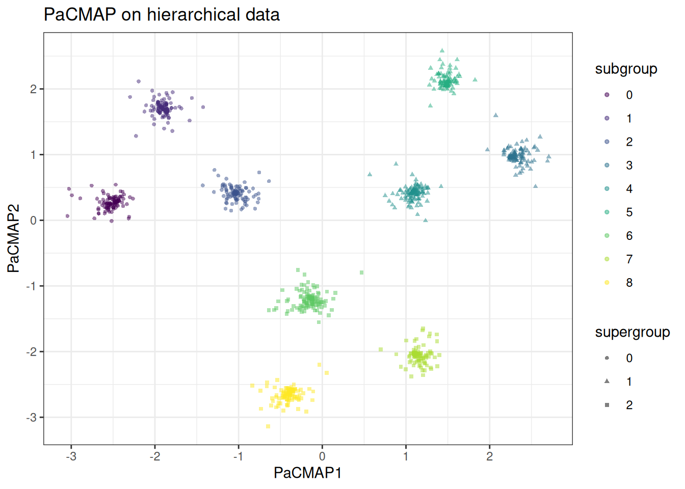
And compare to UMAP
umap_hierarchical <- umap(
  data = hierarchical_data$data,
  k = 15L,
  seed = 42L,
  .verbose = TRUE
)
#> Using n_epochs = 500 (dataset <10k samples or adam_parallel optimiser)

umap_hierarchical_df <- as.data.table(umap_hierarchical) %>%
  `colnames<-`(c("UMAP1", "UMAP2")) %>%
  .[, supergroup := as.factor(hierarchical_data$membership$supergroup)] %>%
  .[, subgroup := as.factor(hierarchical_data$membership$subgroup)]

ggplot(
  data = umap_hierarchical_df,
  mapping = aes(x = UMAP1, y = UMAP2)
) +
  geom_point(
    mapping = aes(colour = subgroup, shape = supergroup),
    size = 1,
    alpha = 0.5
  ) +
  theme_bw() +
  ggtitle("UMAP on hierarchical data") +
  scale_colour_viridis_d()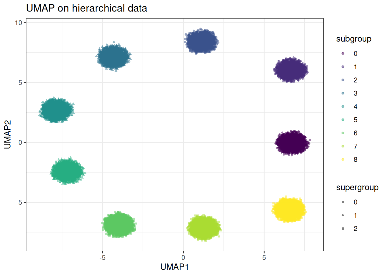
In the PaCMAP embedding, the three supergroups occupy clearly distinct regions of the embedding space at distances roughly proportional to their true separation. Within each supergroup the subclusters are cleanly resolved. In the UMAP embedding the supergroup distances are arbitrary — subclusters from different supergroups may be placed closer together than subclusters within the same supergroup. The global structure is lost in UMAP compared to PacMAP.
Using pre-computed kNN graphs
As with the other methods, if you want to vary PaCMAP-specific parameters without repeating the kNN search, precompute the graph first.
precomputed_knn <- generate_knn_graph(
  data = cluster_data$data,
  k = 50L, # we need to set this high for pacmap
  knn_method = "balltree",
  .verbose = FALSE
)

pacmap_from_knn <- pacmap(
  data = cluster_data$data,
  knn = precomputed_knn,
  k = 10L,
  seed = 42L
)
#> Using provided kNN graph.
With the kNN fixed, we can quickly vary the phase schedule. For example, extending phase 1 to give the global structure more time to settle:
pacmap_long_phase1 <- pacmap(
  data = cluster_data$data,
  knn = precomputed_knn,
  k = 10L,
  pacmap_params = params_pacmap(
    mn_candidate_start = 4L,
    mn_candidate_end = 25L,
    n_further = 5L,
    phase1_end = 250L,
    phase2_end = 400L
  ),
  seed = 42L
)
#> Using provided kNN graph.

pacmap_long_phase1_df <- as.data.table(pacmap_long_phase1) %>%
  `colnames<-`(c("PaCMAP1", "PaCMAP2")) %>%
  .[, membership := as.factor(cluster_data$membership)]

ggplot(
  data = pacmap_long_phase1_df,
  mapping = aes(x = PaCMAP1, y = PaCMAP2)
) +
  geom_point(mapping = aes(colour = membership), alpha = 0.5, size = 0.75) +
  theme_bw() +
  scale_colour_viridis_d(option = "turbo") +
  ggtitle("PaCMAP with extended phase 1")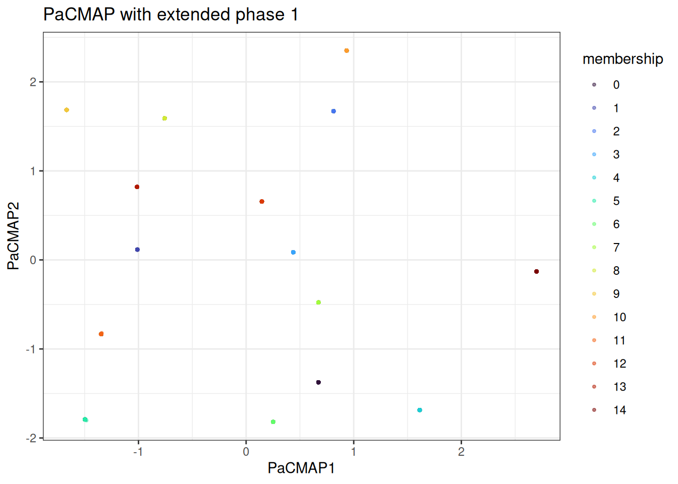
We can appreciate that the points are now all squashed into single points. This is the overall macrostructure in the data.
Benchmarks
benchmark_data <- manifold_synthetic_data(
  type = "cluster",
  n_samples = 10000L
)

microbenchmark::microbenchmark(
  manifold_umap = {
    umap(
      data = benchmark_data$data,
      k = 15L,
      seed = 42L,
      .verbose = FALSE
    )
  },
  manifold_pacmap = {
    pacmap(
      data = benchmark_data$data,
      k = 10L,
      seed = 42L,
      .verbose = FALSE
    )
  },
  times = 3L
)
#> Unit: seconds
#>             expr      min       lq     mean   median       uq      max neval
#>    manifold_umap 1.453757 1.455233 1.458573 1.456708 1.460981 1.465254     3
#>  manifold_pacmap 2.654690 2.680899 2.699042 2.707108 2.721219 2.735330     3
PaCMAP is generally slower than UMAP on the same data since it processes all pairs every epoch rather than sampling. The three-phase schedule with 450 epochs (vs UMAP’s 200–500) compounds this. For most datasets up to ~50k samples this is not a concern in practice, but on very large data the difference becomes noticeable.