library(manifoldsR)
library(magrittr)
library(ggplot2)
library(data.table)
#>
#> Attaching package: 'data.table'
#> The following object is masked from 'package:base':
#>
#>     %notin%
Density-preserving embeddings
2026-09-25
densMAP and den-SNE in manifoldsR
Both the UMAP and the t-SNE vignette carry the same warning: cluster sizes in the embedding mean nothing. A blob that looks twice as wide as its neighbour might be ten times tighter in the input space. That is not a bug, it falls out of the loss. Neither method has any term that cares how spread out a neighbourhood was to begin with.
densMAP and den-SNE fix that, and manifoldsR wraps the fast Rust implementations of both. Original work by Narayan, Berger & Cho.
Intro
The trick is a single extra term in the loss:
is a local radius in the input space, a graph-weighted average squared distance to a point’s neighbours. is the matching radius in the embedding. Maximise the correlation between the two and a tight cluster stays tight, a diffuse one stays diffuse. Everything else about UMAP and t-SNE is untouched: same graph, same repulsion, same optimisers.
Three knobs, set via params_densmap() and params_densne():
-
lambda. Weight of the density term.0gets you plain UMAP or t-SNE back, bit for bit. Defaults are2.0for densMAP and0.5for den-SNE, higher than the reference implementations which defaults to0.1. -
frac. Fraction of the epochs, at the end of the run, over which the term is active. Defaults to0.3. Switching it on from epoch zero fights the initialisation. -
var_shift. Additive shift on the variance of the embedding log-radii. Defaults to0.1, it keeps the correlation well behaved when the radii collapse.
Since the term only runs over the last 30% of epochs, you pay maybe a third more wall-clock than the plain method. Cheap for what you get back.
Measuring what gets lost
To see any of this we need to measure local density, before and after. The package exposes the kNN graph, so it is two lines: mean squared distance to a point’s neighbours, logged. That is the R-side proxy for the the optimiser actually uses.
local_radii <- function(x, k = 15L) {
  knn <- if (inherits(x, "NearestNeighbours")) {
    x
  } else {
    generate_knn_graph(data = x, k = k, knn_method = "kmknn", .verbose = FALSE)
  }
  log(rowMeans(get_dist_mat(knn)^2) + 1e-8)
}
The synthetic cluster generator draws a different standard deviation per cluster, so there is real density variation to preserve.
cluster_data <- manifold_synthetic_data(
  type = "clusters",
  n_samples = 10000L,
  parameters = params_clusters(n_clusters = 8L)
)

original_radii <- local_radii(cluster_data$data)

data.table(
  cluster = as.factor(cluster_data$membership),
  radius = original_radii
)[, .(mean_log_radius = round(mean(radius), 2)), by = cluster][order(cluster)]
#>    cluster mean_log_radius
#>     <fctr>           <num>
#> 1:       0            5.19
#> 2:       1            3.77
#> 3:       2            5.16
#> 4:       3            2.91
#> 5:       4            4.24
#> 6:       5            5.28
#> 7:       6            2.54
#> 8:       7            2.99
A spread of a couple of log units across clusters. Now the question is which embedding keeps it.
densMAP vs UMAP
umap_clusters <- umap(
  data = cluster_data$data,
  seed = 42L,
  .verbose = TRUE
)
#> Using n_epochs = 500 (dataset <10k samples or adam_parallel optimiser)

densmap_clusters <- densmap(
  data = cluster_data$data,
  seed = 42L,
  .verbose = TRUE
)
#> Using n_epochs = 500 (dataset <10k samples or adam_parallel optimiser)
Colour both by the input-space radius. If the method preserved density, the colour gradient should track how big the blobs look.
embedding_dt <- function(embd, names) {
  as.data.table(embd) %>%
    `colnames<-`(names) %>%
    .[, radius := original_radii] %>%
    .[, cluster := as.factor(cluster_data$membership)]
}

umap_df <- embedding_dt(umap_clusters, c("UMAP1", "UMAP2"))
densmap_df <- embedding_dt(densmap_clusters, c("densMAP1", "densMAP2"))

ggplot(data = umap_df, mapping = aes(x = UMAP1, y = UMAP2)) +
  geom_point(mapping = aes(colour = radius), size = 0.5, alpha = 0.6) +
  scale_colour_viridis_c() +
  theme_bw() +
  ggtitle("UMAP, coloured by input-space local radius")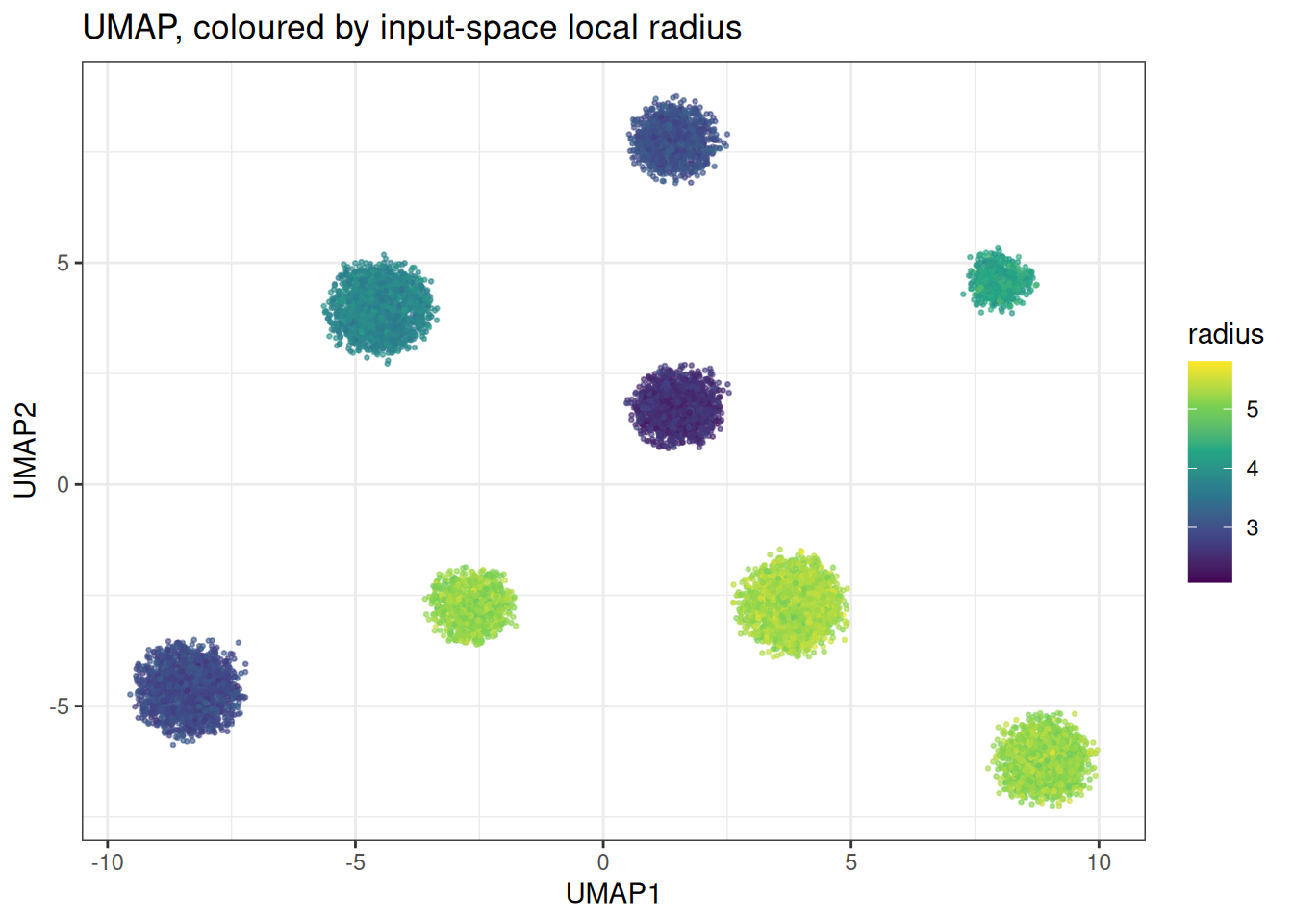
ggplot(data = densmap_df, mapping = aes(x = densMAP1, y = densMAP2)) +
  geom_point(mapping = aes(colour = radius), size = 0.5, alpha = 0.6) +
  scale_colour_viridis_c() +
  theme_bw() +
  ggtitle("densMAP, coloured by input-space local radius")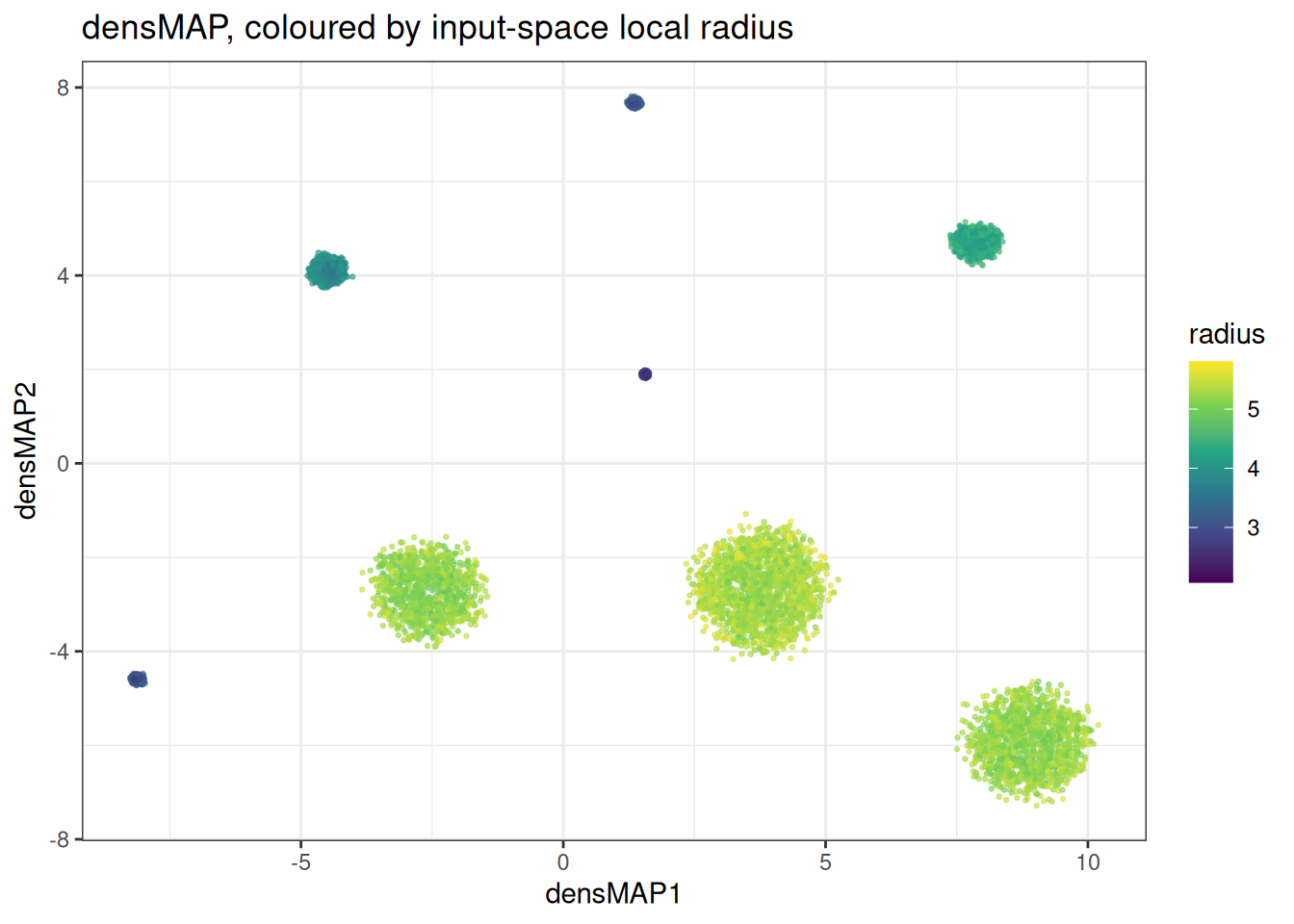
UMAP hands you clusters of roughly equal size regardless of colour. densMAP lets the yellow ones sprawl and squeezes the purple ones. Put a number on it with the Spearman correlation between input and embedding radii:
dens_cor <- function(embd, radii = original_radii) {
  round(
    cor(radii, local_radii(embd), method = "spearman"),
    3
  )
}

data.table(
  method = c("UMAP", "densMAP"),
  rho = c(dens_cor(umap_clusters), dens_cor(densmap_clusters))
)
#>     method    rho
#>     <char>  <num>
#> 1:    UMAP -0.006
#> 2: densMAP  0.919
Set lambda = 0 and you are back to plain UMAP, which is a handy sanity check and also the cheapest way to A/B the thing:
identical_to_umap <- all.equal(
  densmap(
    data = cluster_data$data,
    dens_params = params_densmap(lambda = 0),
    seed = 42L,
    .verbose = FALSE
  ),
  umap_clusters
)

isTRUE(identical_to_umap)
#> [1] TRUE
den-SNE vs t-SNE
Same data, same story, different loss.
tsne_df <- embedding_dt(tsne_clusters, c("tSNE1", "tSNE2"))
densne_df <- embedding_dt(densne_clusters, c("denSNE1", "denSNE2"))

ggplot(data = tsne_df, mapping = aes(x = tSNE1, y = tSNE2)) +
  geom_point(mapping = aes(colour = radius), size = 0.5, alpha = 0.6) +
  scale_colour_viridis_c() +
  theme_bw() +
  ggtitle("t-SNE, coloured by input-space local radius")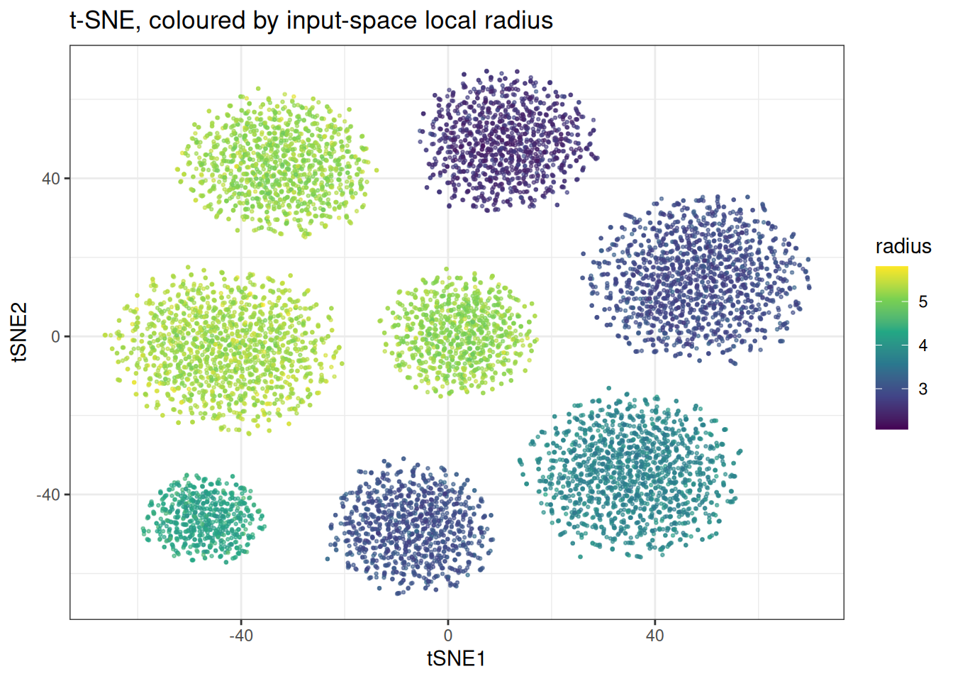
ggplot(data = densne_df, mapping = aes(x = denSNE1, y = denSNE2)) +
  geom_point(mapping = aes(colour = radius), size = 0.5, alpha = 0.6) +
  scale_colour_viridis_c() +
  theme_bw() +
  ggtitle("den-SNE, coloured by input-space local radius")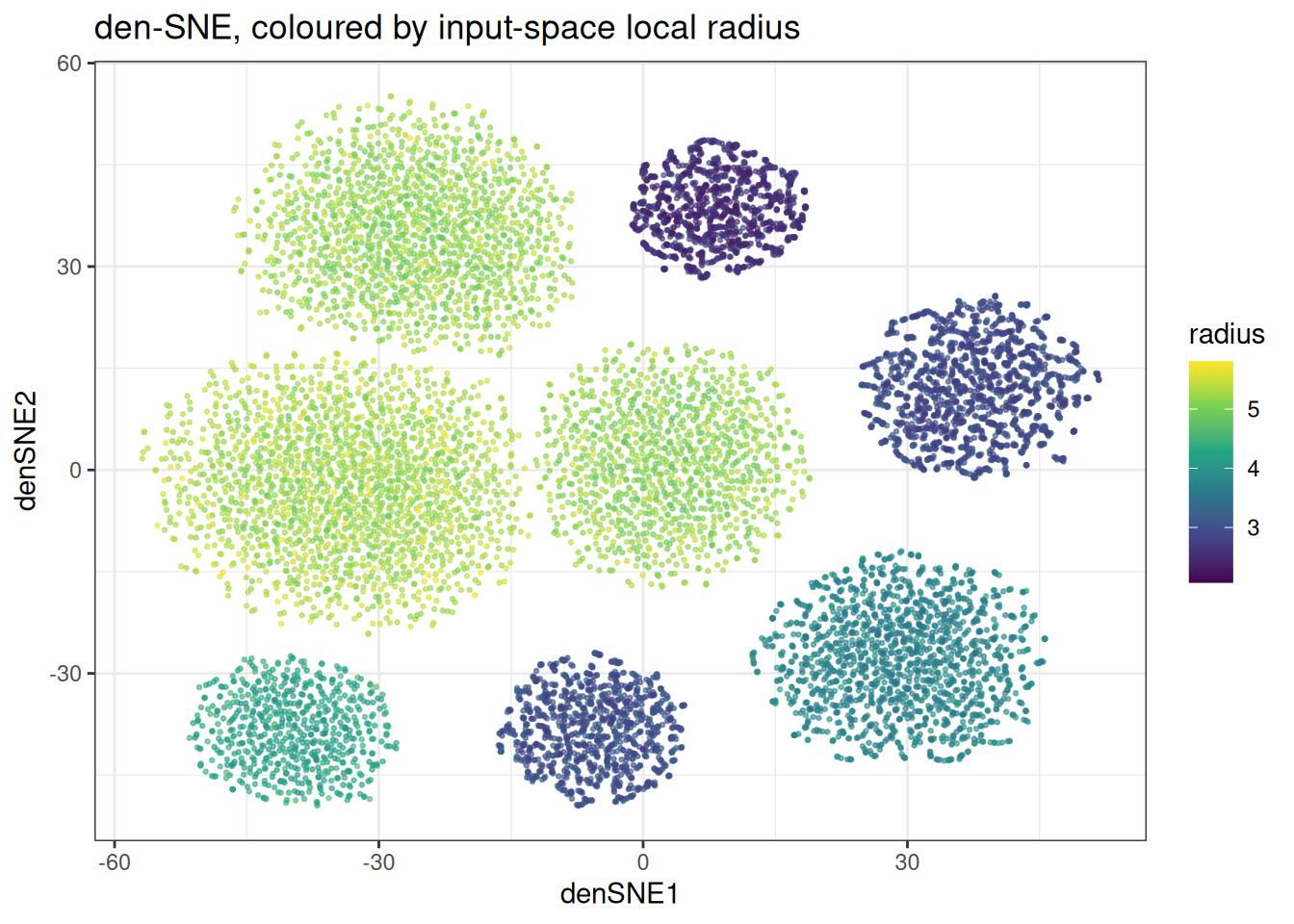
data.table(
  method = c("t-SNE", "den-SNE"),
  rho = c(dens_cor(tsne_clusters), dens_cor(densne_clusters))
)
#>     method   rho
#>     <char> <num>
#> 1:   t-SNE 0.082
#> 2: den-SNE 0.822
t-SNE starts from a marginally better place than UMAP, since the exaggeration schedule leaves a little size variation intact, but it is still close to nothing. den-SNE pulls well clear of it, though it does not reach densMAP. That gap is real and expected: the default lambda is four times smaller, and the t-SNE repulsion fights the density term harder.
Note: den-SNE inherits every t-SNE constraint. Two dimensions only, and if you hand it a pre-computed kNN graph the k has to exceed the perplexity.
Varying density along a manifold
Clusters are the easy case. The biased swiss roll samples non-uniformly along the roll, so the density gradient is continuous rather than blocky.
swissrole_data <- manifold_synthetic_data(
  type = "biased_swiss_role",
  n_samples = 5000L,
  parameters = params_swiss_role_biased(noise = 0.1, bias = 2.5)
)

swiss_radii <- local_radii(swissrole_data$data)

swiss_umap <- umap(
  data = swissrole_data$data,
  knn_method = "exhaustive",
  seed = 42L,
  .verbose = FALSE
)

swiss_densmap <- densmap(
  data = swissrole_data$data,
  knn_method = "exhaustive",
  seed = 42L,
  .verbose = FALSE
)
swiss_dt <- function(embd, names) {
  as.data.table(embd) %>%
    `colnames<-`(names) %>%
    .[, radius := swiss_radii]
}

ggplot(
  data = swiss_dt(swiss_umap, c("UMAP1", "UMAP2")),
  mapping = aes(x = UMAP1, y = UMAP2)
) +
  geom_point(mapping = aes(fill = radius), shape = 21, size = 2, alpha = 0.5) +
  scale_fill_viridis_c() +
  theme_bw() +
  ggtitle("UMAP on the biased swiss roll")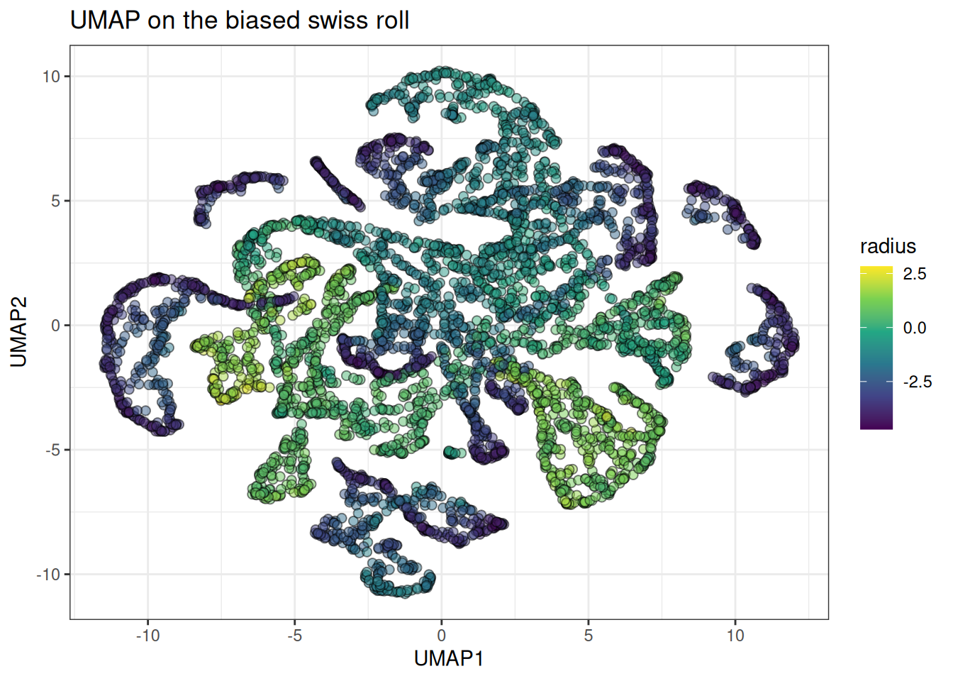
ggplot(
  data = swiss_dt(swiss_densmap, c("densMAP1", "densMAP2")),
  mapping = aes(x = densMAP1, y = densMAP2)
) +
  geom_point(mapping = aes(fill = radius), shape = 21, size = 2, alpha = 0.5) +
  scale_fill_viridis_c() +
  theme_bw() +
  ggtitle("densMAP on the biased swiss roll")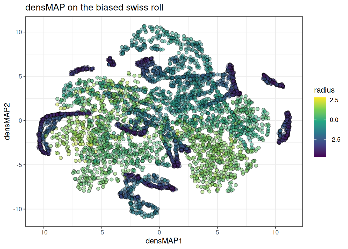
Using pre-computed kNN graphs
Both take a NearestNeighbours object, same as their plain counterparts. Build it once, reuse it across methods and parameter sweeps. Watch the k if you are feeding den-SNE.
knn <- generate_knn_graph(
  data = cluster_data$data,
  k = 90L,
  knn_method = "kmknn",
  .verbose = FALSE
)

densmap_from_knn <- densmap(
  data = cluster_data$data,
  knn = knn,
  seed = 42L,
  .verbose = TRUE
)
#> Using n_epochs = 500 (dataset <10k samples or adam_parallel optimiser)
#> Using provided kNN graph.

densne_from_knn <- densne(
  data = cluster_data$data,
  knn = knn,
  perplexity = 30,
  seed = 42L,
  .verbose = TRUE
)
#> Using provided kNN graph.

data.table(
  method = c("densMAP (kNN)", "den-SNE (kNN)"),
  rho = c(dens_cor(densmap_from_knn), dens_cor(densne_from_knn))
)
#>           method   rho
#>           <char> <num>
#> 1: densMAP (kNN) 0.922
#> 2: den-SNE (kNN) 0.890
Tuning lambda
The usual framing is that lambda trades cluster separation against density fidelity. Sweep it and check whether that actually holds here. We wil will be using a smaller data set to do the sweep.
cluster_data_small <- manifold_synthetic_data(
  type = "clusters",
  n_samples = 2000L,
  parameters = params_clusters(n_clusters = 8L)
)

original_radii_small <- local_radii(cluster_data_small$data)

data.table(
  cluster = as.factor(cluster_data_small$membership),
  radius = original_radii_small
)[, .(mean_log_radius = round(mean(radius), 2)), by = cluster][order(cluster)]
#>    cluster mean_log_radius
#>     <fctr>           <num>
#> 1:       0            5.35
#> 2:       1            3.95
#> 3:       2            5.36
#> 4:       3            3.09
#> 5:       4            4.38
#> 6:       5            5.46
#> 7:       6            2.68
#> 8:       7            3.18
knn_small <- generate_knn_graph(
  data = cluster_data_small$data,
  k = 90L,
  knn_method = "kmknn",
  .verbose = FALSE
)
And now the actual sweep.
lambda_sweep <- rbindlist(lapply(c(0, 0.5, 2, 5, 10), \(l) {
  embd <- densmap(
    data = cluster_data_small$data,
    knn = knn_small,
    dens_params = params_densmap(lambda = l),
    seed = 42L,
    .verbose = TRUE
  )

  sep <- rs_check_cluster_separation(
    embd = embd,
    cluster_membership = as.integer(cluster_data_small$membership)
  )

  data.table(
    lambda = l,
    rho = dens_cor(embd, radii = original_radii_small),
    separation = round(mean(sep$between_dists) / mean(sep$within_dists), 2)
  )
}))
#> Using n_epochs = 500 (dataset <10k samples or adam_parallel optimiser)
#> Using provided kNN graph.
#> Using n_epochs = 500 (dataset <10k samples or adam_parallel optimiser)
#> Using provided kNN graph.
#> Using n_epochs = 500 (dataset <10k samples or adam_parallel optimiser)
#> Using provided kNN graph.
#> Using n_epochs = 500 (dataset <10k samples or adam_parallel optimiser)
#> Using provided kNN graph.
#> Using n_epochs = 500 (dataset <10k samples or adam_parallel optimiser)
#> Using provided kNN graph.

lambda_sweep
#>    lambda    rho separation
#>     <num>  <num>      <num>
#> 1:    0.0 -0.007      17.94
#> 2:    0.5  0.919      31.57
#> 3:    2.0  0.929      30.78
#> 4:    5.0  0.940      27.39
#> 5:   10.0  0.945      23.72
ggplot(data = lambda_sweep, mapping = aes(x = lambda)) +
  geom_line(mapping = aes(y = rho, colour = "density fidelity (rho)")) +
  geom_point(mapping = aes(y = rho, colour = "density fidelity (rho)")) +
  geom_line(
    mapping = aes(
      y = separation / max(separation),
      colour = "cluster separation (scaled)"
    )
  ) +
  geom_point(
    mapping = aes(
      y = separation / max(separation),
      colour = "cluster separation (scaled)"
    )
  ) +
  labs(y = NULL, colour = NULL) +
  theme_bw() +
  theme(legend.position = "bottom") +
  ggtitle("Density fidelity against cluster separation")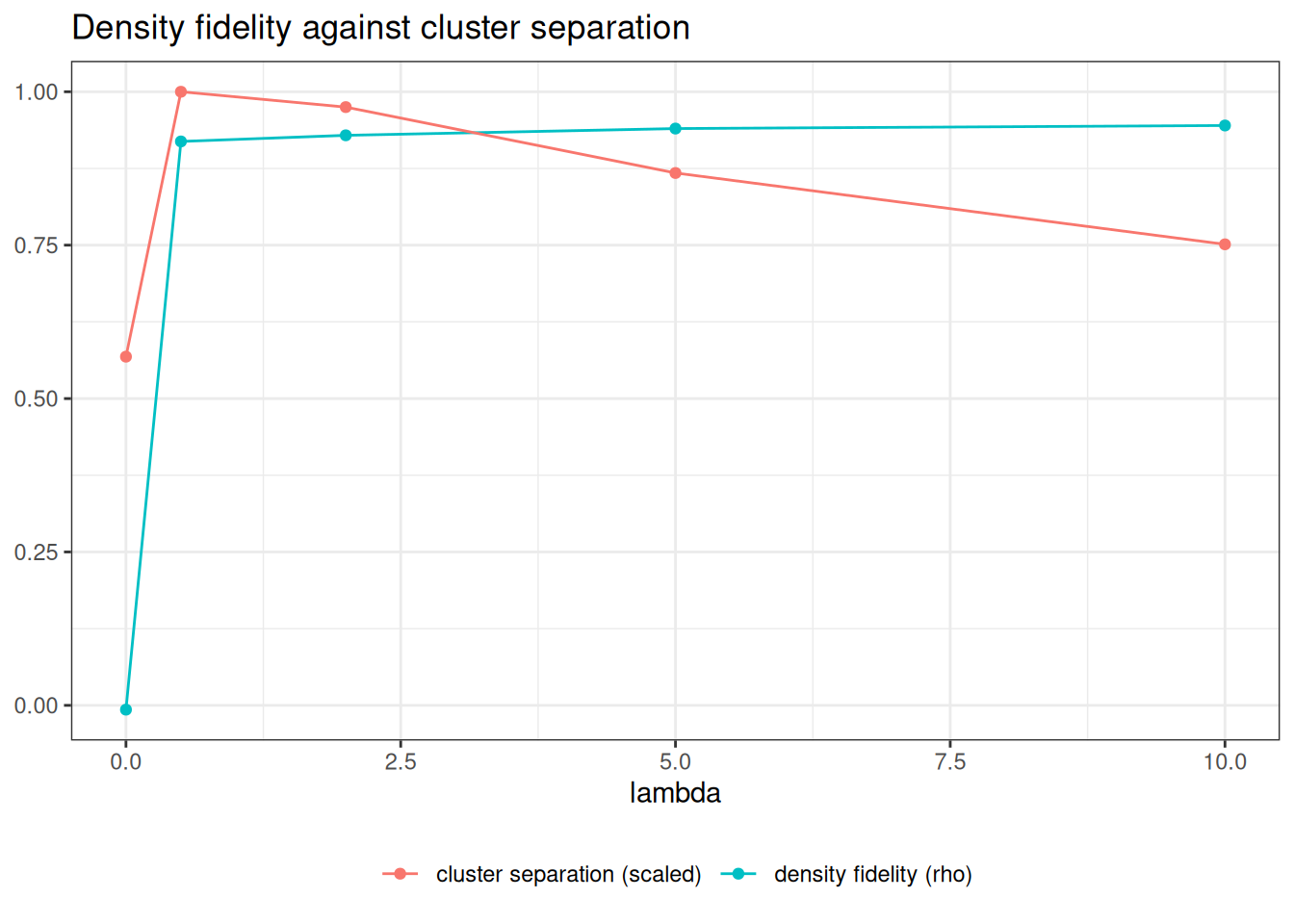
Not quite what the framing promises. Almost all the fidelity arrives by lambda = 0.5 and barely moves after that. Separation improves over plain UMAP the moment the density term switches on, peaks around 0.5, then erodes slowly. So on this data the trade-off only starts biting well past the default, and even at lambda = 10 separation sits above the lambda = 0 baseline.
Take that as a reason to sweep on your own data rather than as a general result. Well-separated synthetic blobs are the friendly case, and 2.0 is a sane starting point precisely because it sits on the flat part of both curves.
Where to go next
The obvious extension is exposing the local radii themselves rather than recomputing a proxy in R, so you could colour by what the optimiser actually saw.