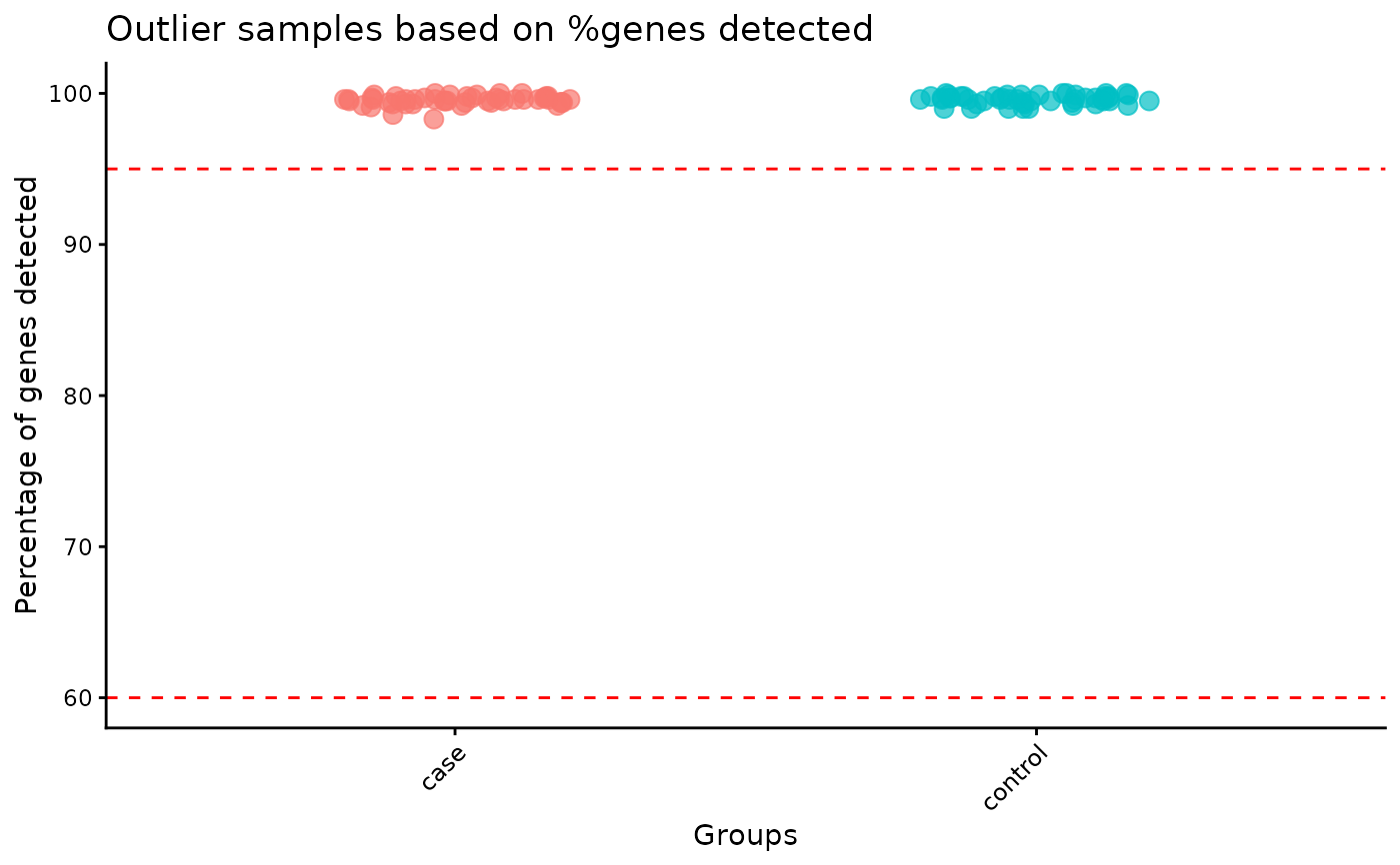
Helper plot function for identification of outliers
plot_preprocessing_outliers.RdBeeswarm plot of the percentage of detected genes per sample, with the outlier cutoffs drawn in. Used in the bulk DGE pre-processing report.
Examples
# percentage of detected genes with the outlier cutoffs drawn in
syn <- synthetic_bulk_cor_matrix()
samples <- data.table::data.table(
  cohort = rep(c("case", "control"), each = 50),
  perc_detected_genes = colMeans(syn$counts > 0) * 100
)
plot_preprocessing_outliers(
  samples,
  group_col = "cohort",
  min_perc = 60,
  max_perc = 95
)